Blue Walnut – brand identity
Brandis developed a brand identity for Blue Walnut.
Blue Walnut is a btb company that uses an in-depth knowledge of e-commerce and AI to analyse and boost e-commerce performance.
Studio brandis designed a new brand identity for Toccata Financial Services. Toccata is an administrative services boutique, rendering international administrative, legal and accounting services to medium and large sized companies and private equity funds.
Moodboard

Colour
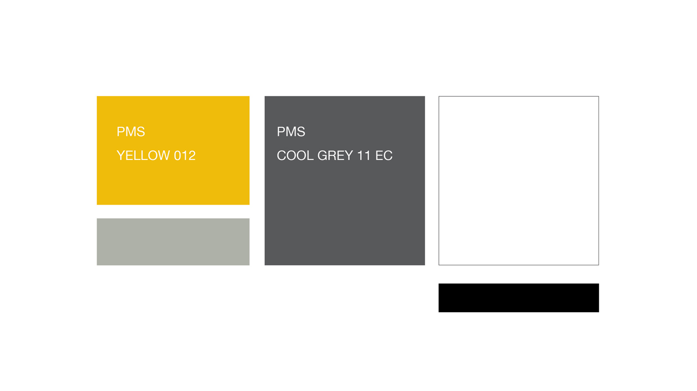
The colour scheme is based on gold and silver as a reference to financial services.


Logo development
We explored several routes for the logo. Ranging form an heraldic approach to computation.


Brand symbol
The brand symbol looks like a folded page. This is a reference to legal services and transparant accounting. The silver shape is pointing upwards expressing ambition.
Typography
The serif type in the logo and the descriptor have been chosen to give a classic look – while the symbol gives it a modern feel.
‘The typeface for ‘Toccata’ is set in Cochin.
It was originally produced in 1912 by Georges Peignot for the Paris foundry G. Peignot et Fils and was based on the copperplate engravings of 18th century French artist Charles-Nicolas Cochin, from which this serif typeface also takes its name.
The descriptor ‘Financial Services’ is set in a Baskerville. Designed in 1760 by British type designer John Baskerville. The line around ‘financial services’ gives the logo a base and a grounded look.
Website
As a main tool of communication we designed a website. All the information is presented in a clear and consistent manner.
You can check the results here:
Toccata.nl
2020 | Financial Industry
Deliverables
Brand identity, UX design and wordpress website building.
Team
Toccata Financial Services: Steef van Berkel, Jan van Berne, Twan Uiterlijk.

Brandis developed a brand identity for Blue Walnut.
Blue Walnut is a btb company that uses an in-depth knowledge of e-commerce and AI to analyse and boost e-commerce performance.

brandis developped a brand identity for Lancee. Lancee empowers young woman in the professional market and helps businesses with matters concerning inclusivity.
Graphic language / applications, avatar, website, campaign concept.

Studio brandis developed the brand identity, communication and campaign for ‘Legale Zaken’. It covers business news with a judicial angle. You will find interviews, opinion pieces, juridicum vitae’s, job offers, foreign news in addition articles by expert partners like Deloitte, Pinsent Masons, Loyens & Loeff and others.

Brand identity, company presentation and wordpress website for London based investment company Bridford.